Is M&S getting cooler, or am I just getting older?
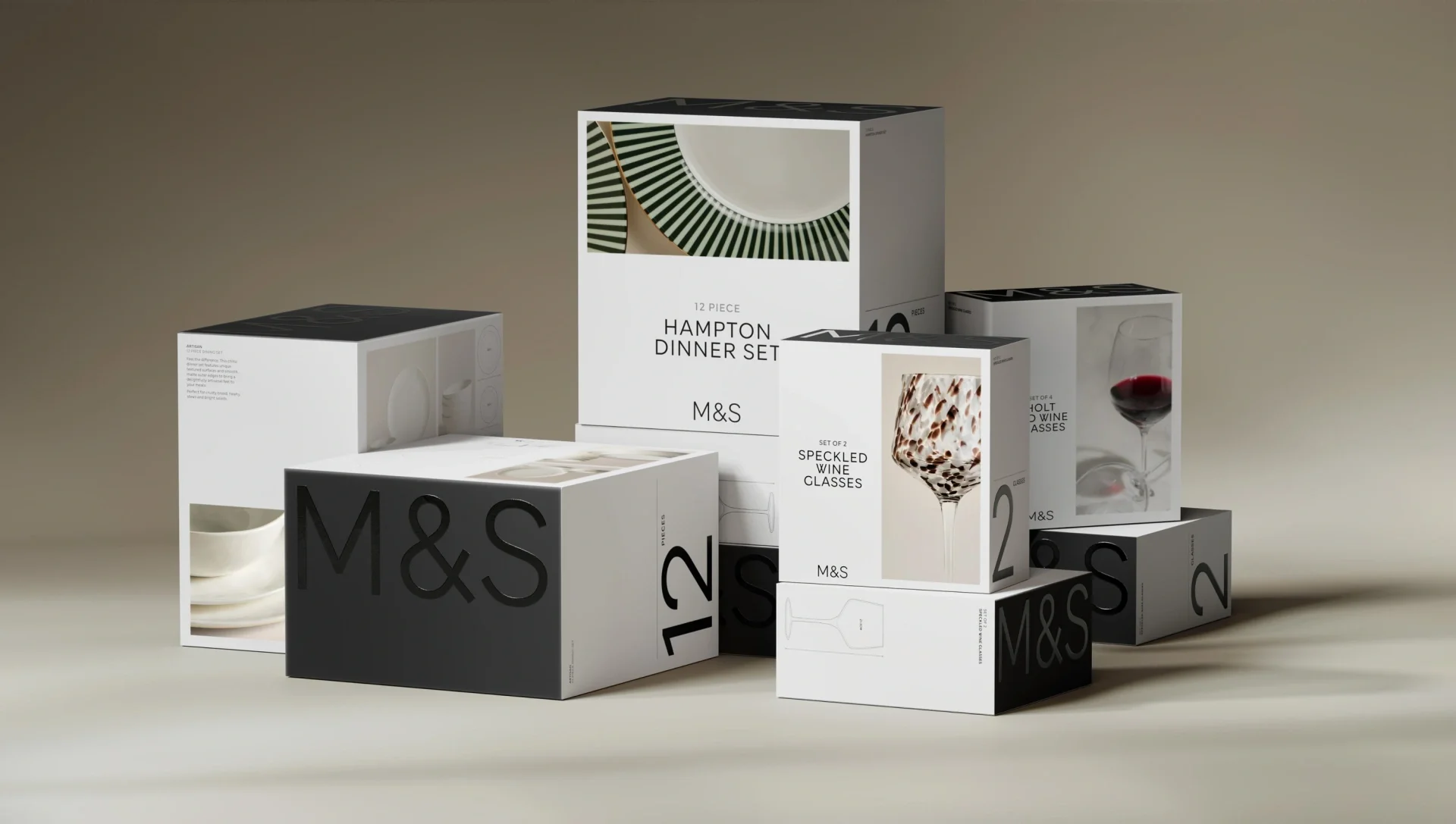
Packaging update from Mother Design
It's the age-old meme. I'm 35, and M&S has quietly become one of the shops I find myself drawn to more and more, especially the food hall. So either M&S is getting cooler, or I'm just getting older.
Honestly? Probably a bit of both. But their new packaging for Home and Lingerie, created with the brilliant team at Mother Design, makes a strong case for the first one. It looks absolutely beautiful, and it's a masterclass in a brand signal I talk about a lot with founders: restraint.
How good brands drift
The previous M&S packaging wasn't a million miles away from where it is now. That's the interesting bit. Brands rarely wake up one morning in a mess. They veer off track ever so slightly, one pack at a time.
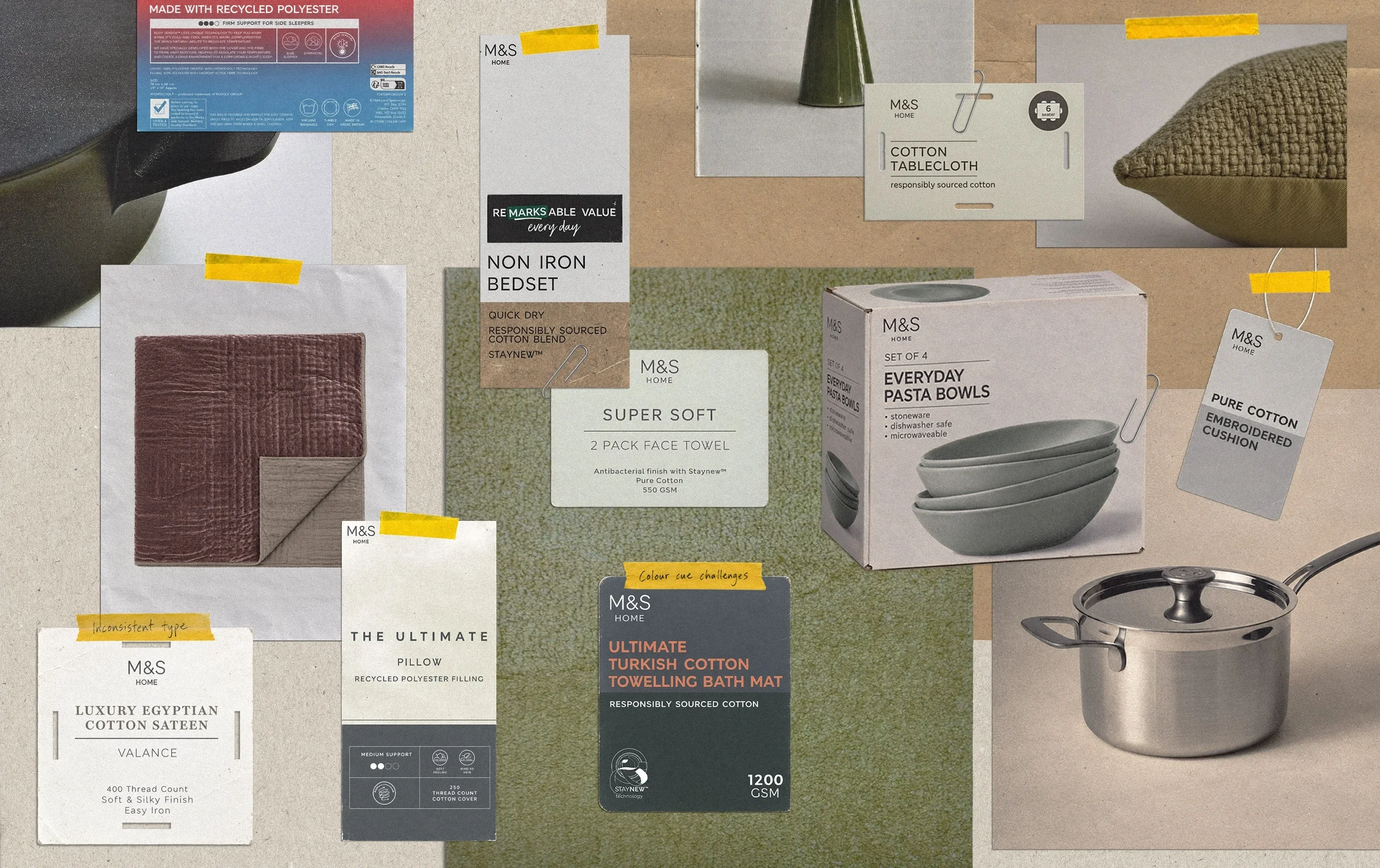
Packaging update from Mother Design
This is really common in big brands. You've got lots of different agencies and creatives working on different ranges, each adding a sub-brand here, a colour code there, another claim on the front of pack. Before long you've got a convoluted, mixed-up world, and the brand often doesn't even realise it's happened.
What I admire about M&S is that they spotted that gap before it became a real problem. They brought in a brilliant agency and built a proper system, one that's flexible enough to stretch from saucepans to pyjamas, but still feels clean, clear and unmistakably M&S. Most importantly, it doesn't get in the way of the product.
Less is more is the language of premium
With luxury, less is more. And this update definitely does that. Mother Design's guiding idea was to strip out to stand out: fewer sub-brands, fewer competing colour codes, less over-explaining. In their place come a bigger, prouder M&S logo, a single typeface used with real discipline, and lovely crafted details like black-on-black varnished logos, embossed swing tags and more products in boxes rather than plastic bags.
The result clearly feels like M&S, but it could just as easily sit alongside a high-quality fashion brand. That fits the direction M&S has been heading in for a while now.
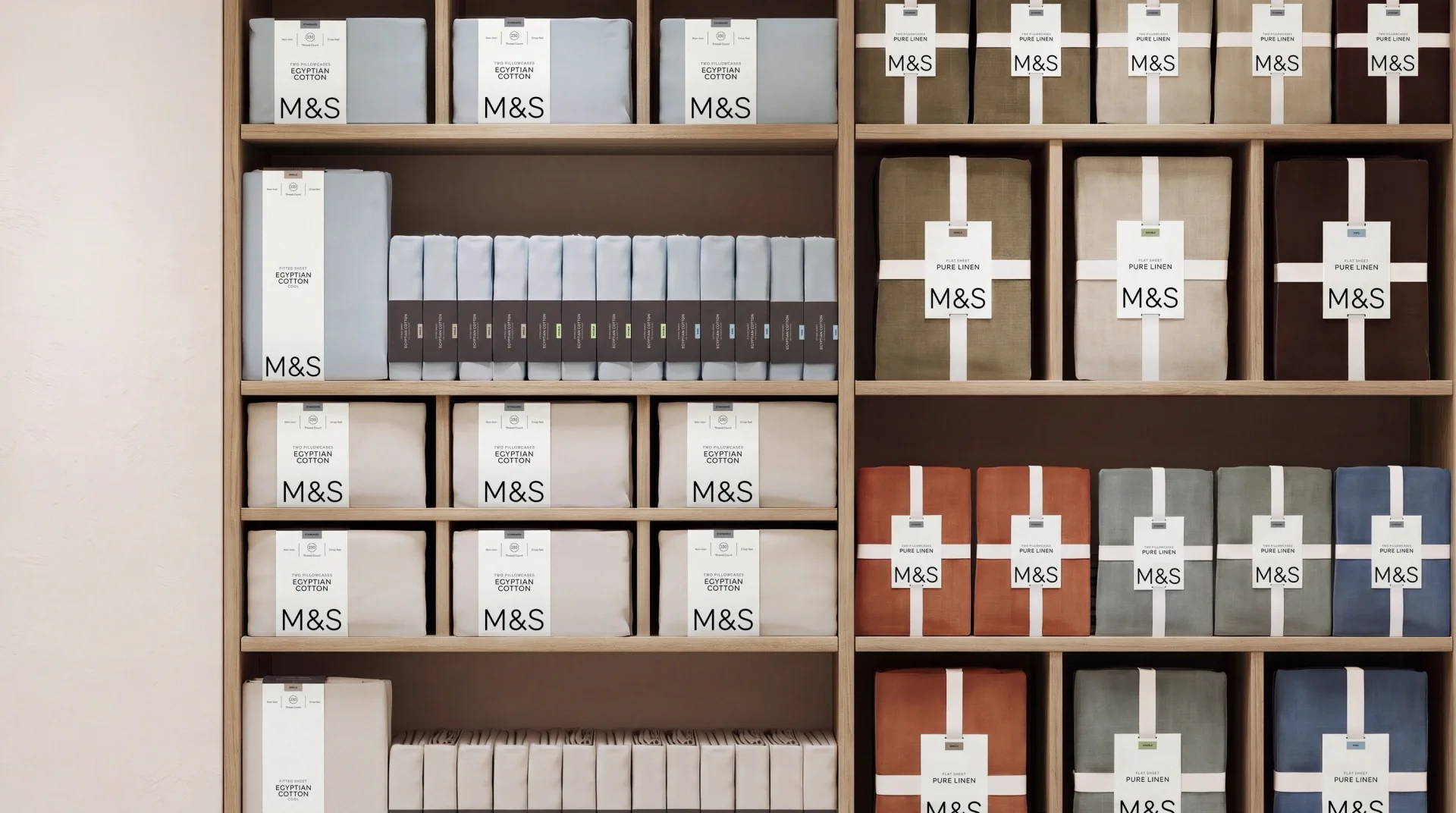
It's aspirational. It looks like the lifestyle I'd like to lead. And yet the price point is still more attainable than the high-end brands it now visually rubs shoulders with. That's the sweet spot: restraint lets customers feel the quality before they've even picked the product up.
What home product founders can take from it
You don't need M&S's budget to borrow M&S's thinking. Here's what I'd take away.
1. Don't throw the kitchen sink at it. Every claim, badge and flourish you add makes the others work less hard. Decide what genuinely matters to your customer and let the rest go.
2. Pick one beautiful typeface and stick to it. M&S use a single typeface across thousands of products, flexed through different weights and sizes. Consistency is what makes it feel confident rather than busy.
3. Make the product the hero. This is where M&S have really succeeded. The typography is beautiful, but it's the photography doing the selling. It isn't AI, it's their own image bank of their own products, shot with care, in gorgeous colourways.
4. Sell the lifestyle, not just the item. Your imagery should show the life your customer wants to imagine themselves in. That's what turns a towel into a little piece of a calmer, nicer home, and it's what gives people permission to pay a bit more.
Want your brand to feel like this?
If you're reading this and thinking your brand could do with a bit of that M&S restraint, start with my free 10 Brand Signals guide. It walks you through the signals that tell customers your product is worth paying more for, so you can spot which ones are working for you and which are quietly working against you.
And if you'd rather talk it through, I'm always happy to have a chat about where your brand is now and what it would take to get it where you want it to be.
-
The new M&S Home and Lingerie packaging was created by branding agency Mother Design. You can see the full case study on their website.
-
M&S stripped things back. Sub-brands, confusing colour codes and over-explanation were removed, and replaced with a bigger M&S logo, one consistent typeface, clear product names, premium finishes and more boxed packaging instead of plastic bags.
-
Start with restraint. Choose one beautiful typeface, cut back the claims and badges on your packaging, invest in your own product photography and make sure every touchpoint looks like it belongs to the same brand. You don't need a big budget, you need clear decisions applied consistently.
-
Restraint means saying less so the important things stand out. Premium and luxury brands use white space, simple typography and fewer messages because confidence reads as quality. A crowded pack can make even a great product feel cheaper than it is.
-
If customers like your product but your brand feels inconsistent, busy or slightly off, a refresh is often enough to pull it back on track. If your brand no longer reflects who you sell to, what you charge or where you want to be stocked, it may be time for a full rebrand. A quick chat can help you work out which one you need.
Or read this article here -
Yes. Customers judge value long before they read the price, using signals like packaging, photography and tone of voice. When those signals feel premium, people are more comfortable paying a premium.
You can find out the extra value here in my Turn it Up calculator -
Absolutely. Trumpet is a brand and design studio that works with founders of everyday home products, from brand identity and packaging to digital and advertising copy. If you want your brand to sit comfortably alongside the likes of M&S, book a chat