
Fight Like a Girl – Branding
Brand Identity for a Non-Profit Fitness Movement
Sector
Fitness, Non-Profit & Community Sport
The Challenge
Replacing generic, low-budget "AI slop" with an authentic, authoritative fitness brand capable of securing nationwide funding.
The Outcome
Engineered a powerful, cult-like identity that helped the team secure £25,000+ in funding within the first 4 months.
The Noise
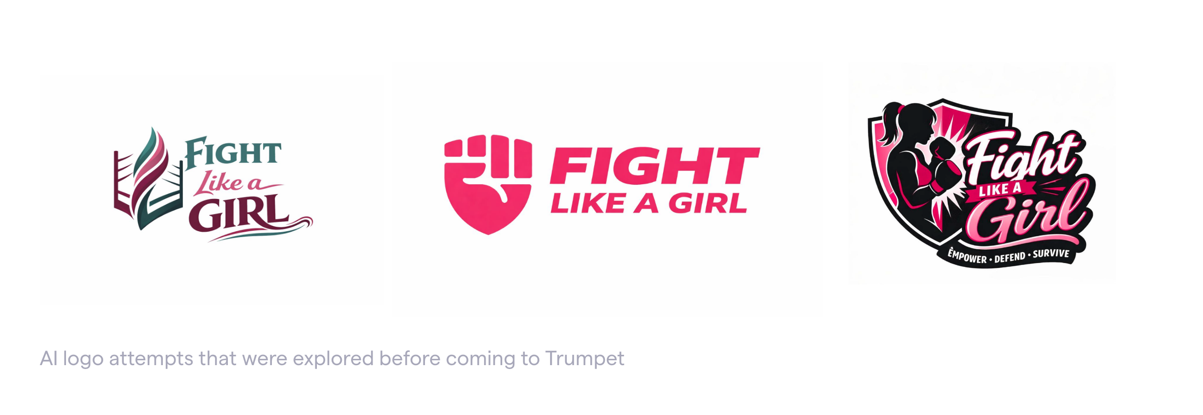
The non-profit and grassroots fitness sectors are typically plagued by low-budget, uninspiring visual identities. Because startup capital is tight, many founders resort to quick, automated AI generation toolkits.
When the team behind Fight Like a Girl came to Trumpet Creative, they had already fallen into this trap. They quickly realised that generic, robotic designs cannot communicate the sweat, effort, and integrity that goes into a real-world fitness movement. Without an ownable identity or a clear visual rallying cry, most fitness startups struggle to drum up public trust, stand out in a crowded landscape, or convince serious corporate sponsors to back them.
The Clarity
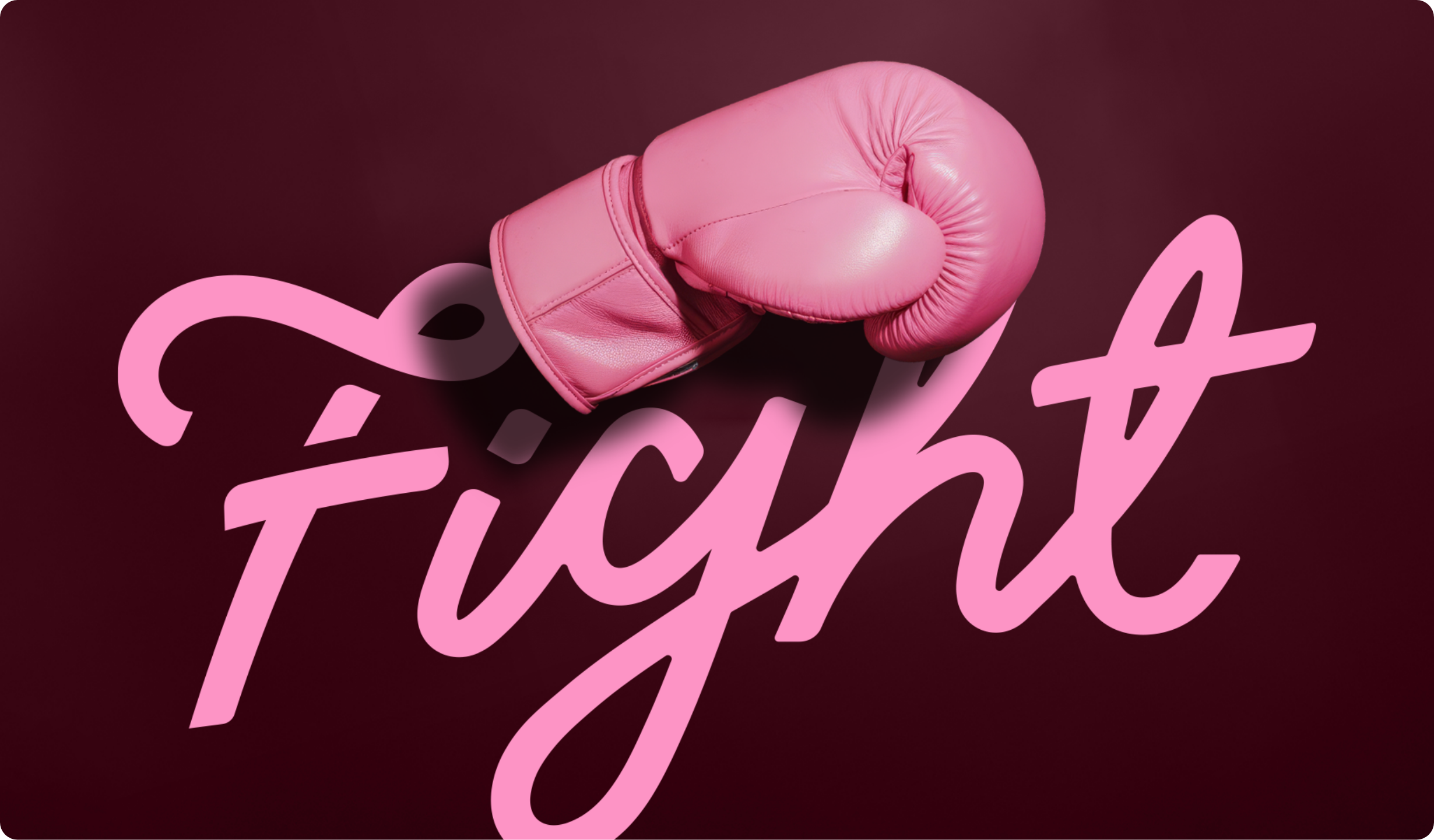
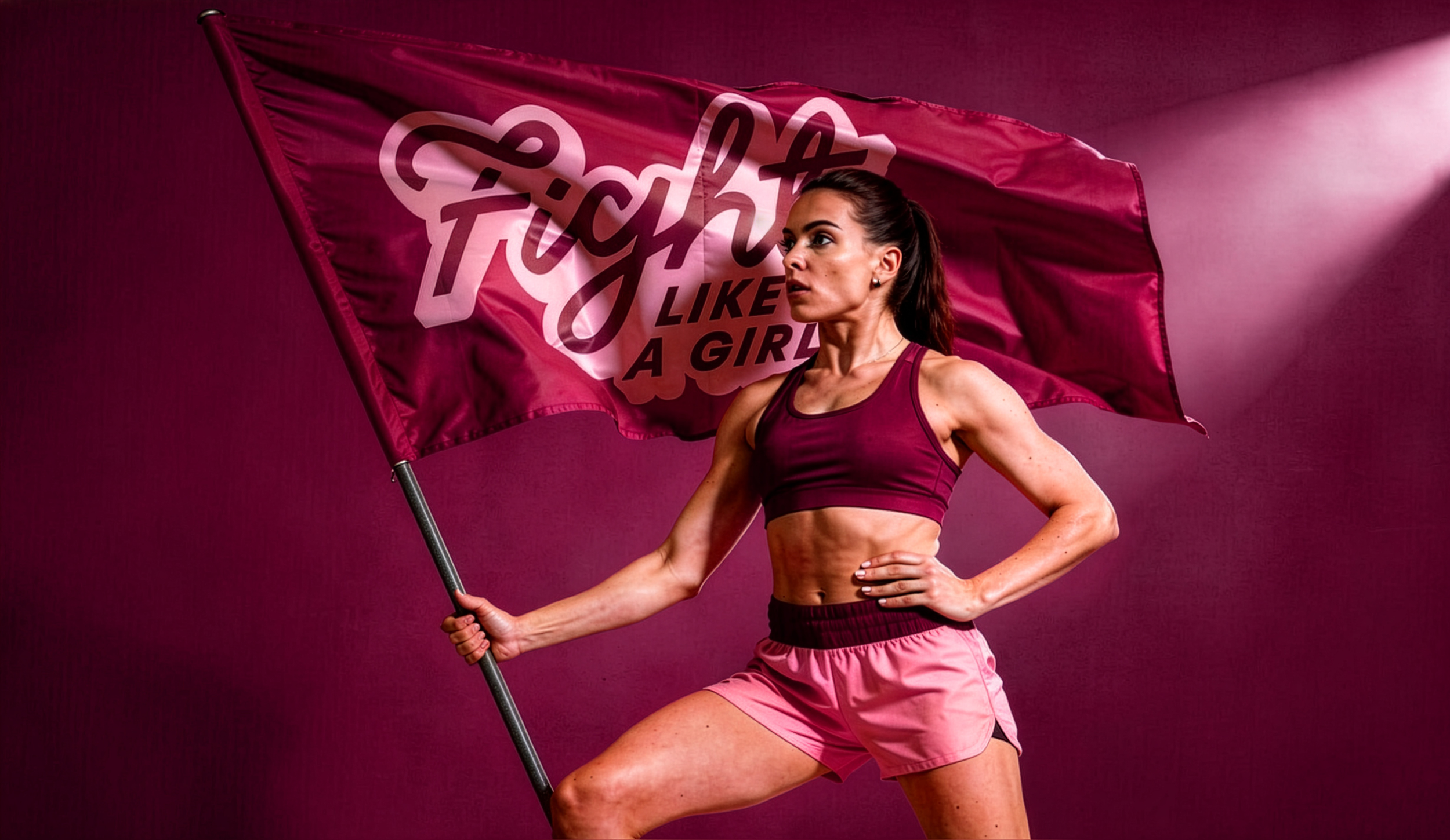
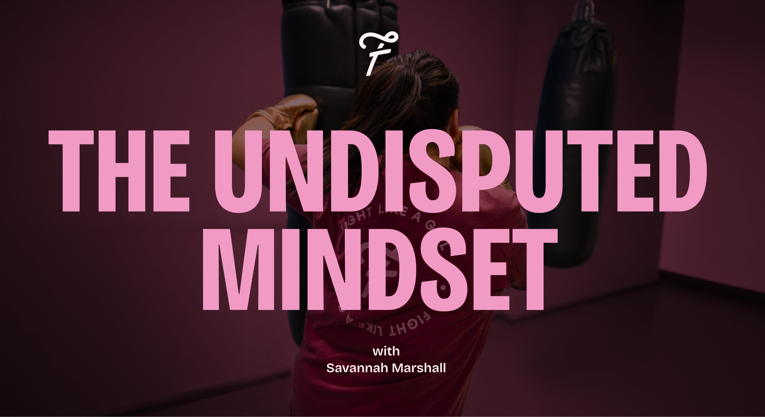
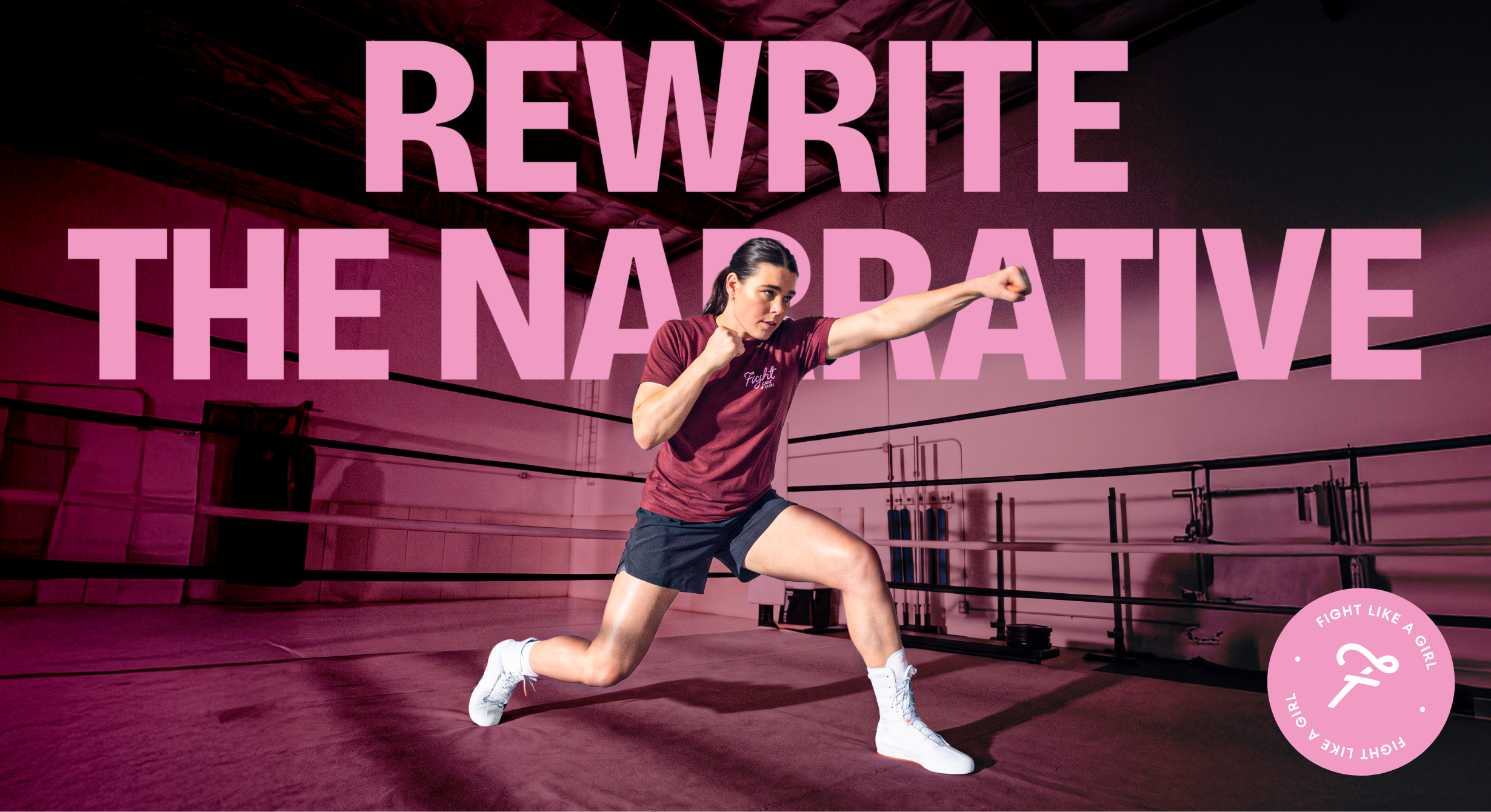
We knew from the start that we wanted to build a cult-like following for Fight Like a Girl. A cause people could truly rally behind without the clunky, predictable "boxing gloves" tropes typically found in boxing branding.
Our design strategy focused on shifting them into a nationwide professional tier:
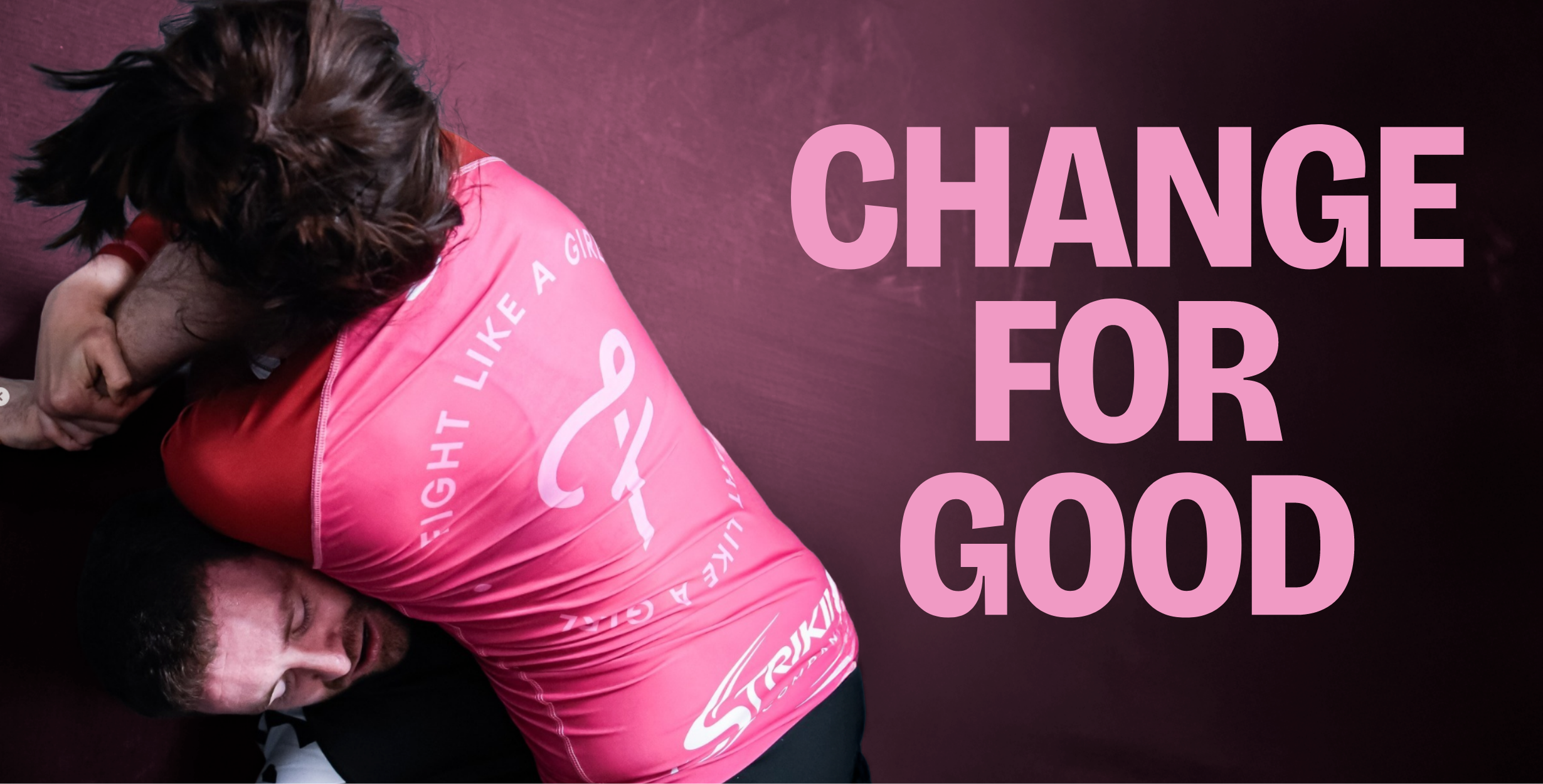
A Modern Icon of Empowerment: We designed a custom brand symbol that serves as a subtle, powerful nod to a female standing up for herself. It looks less like a local charity logo and more like an elite activewear mark.
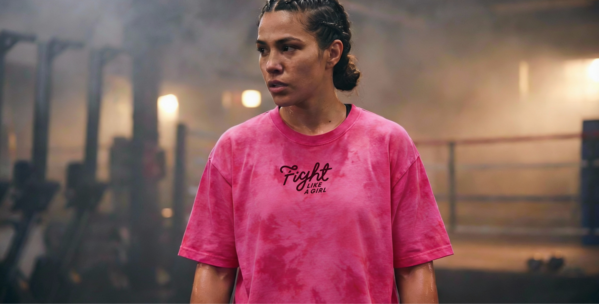
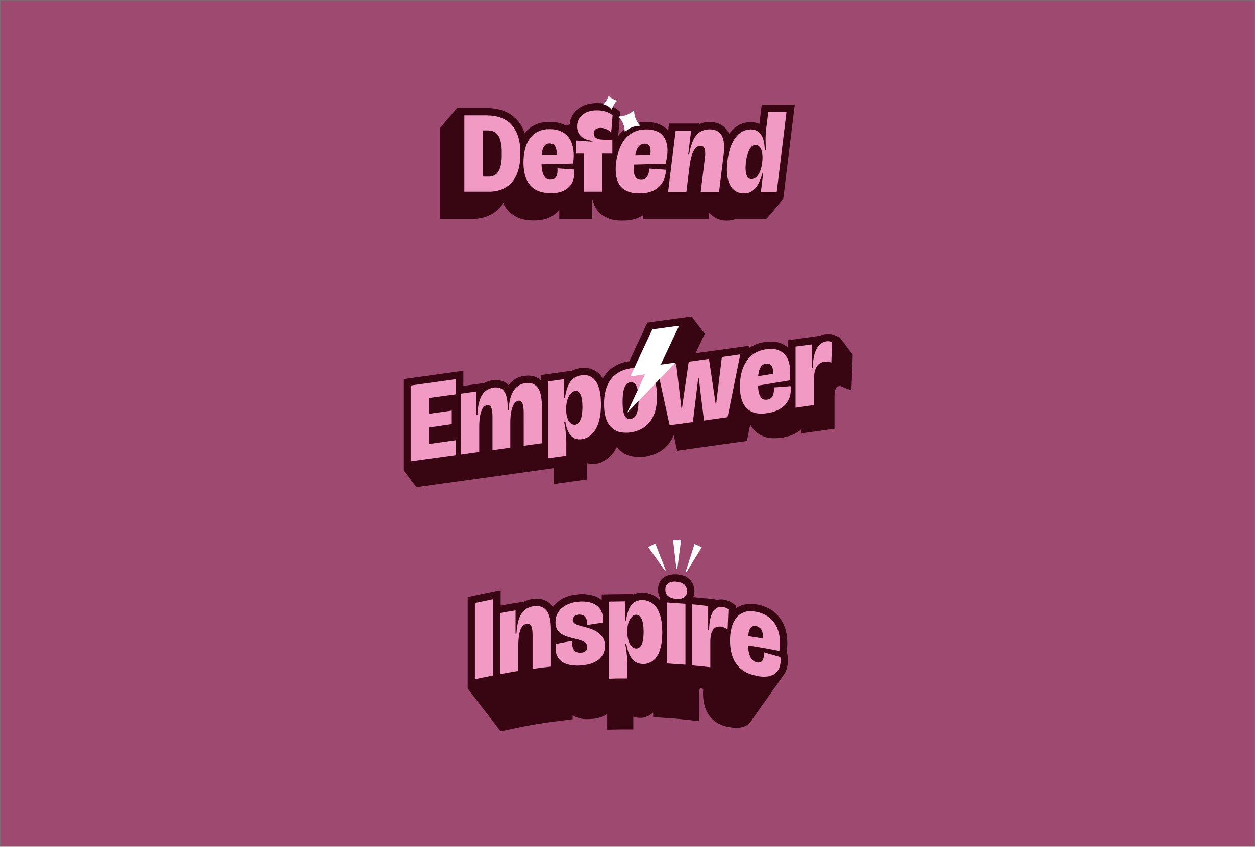
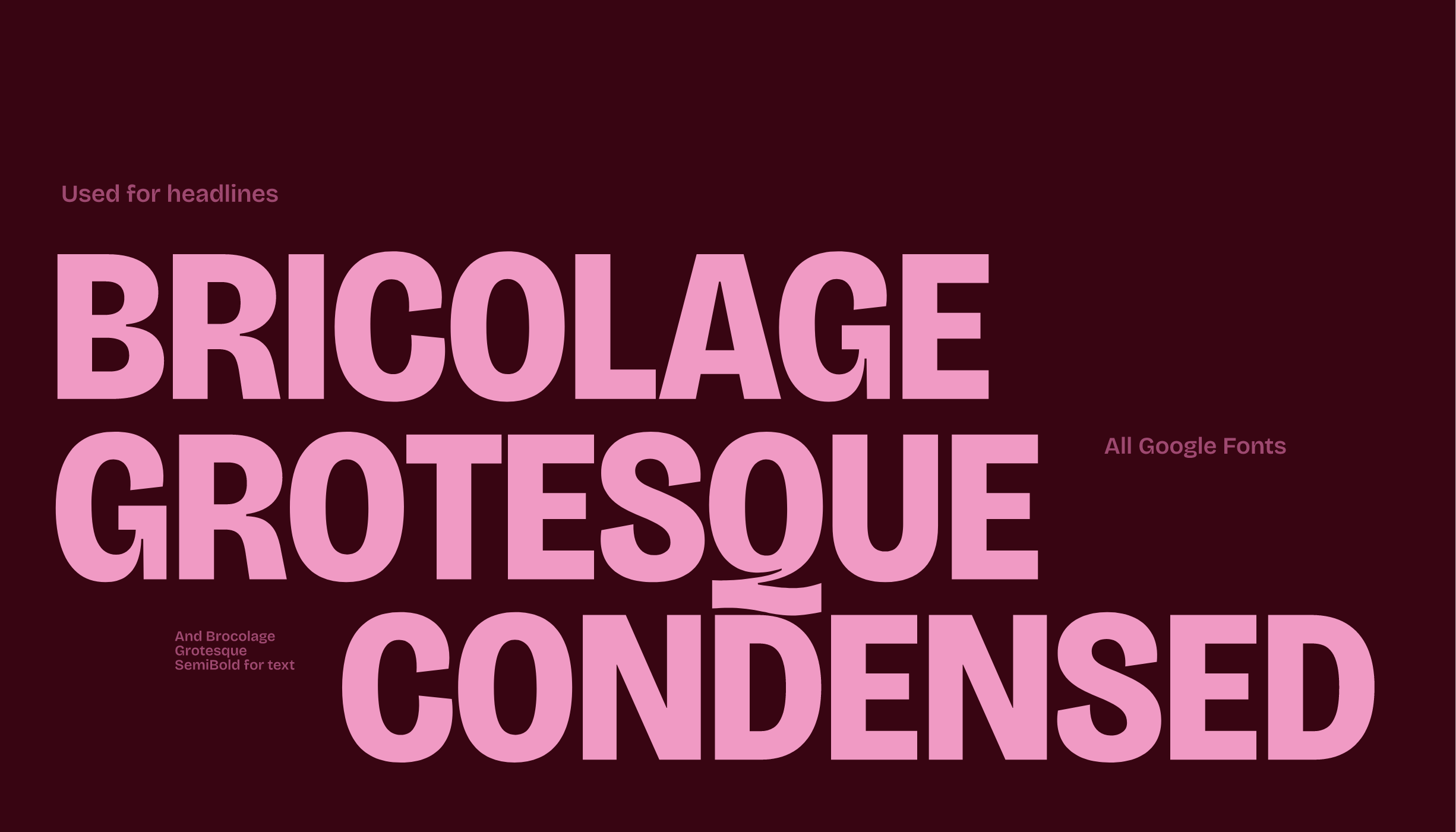
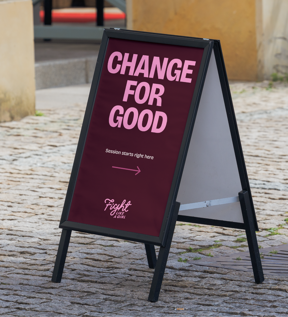
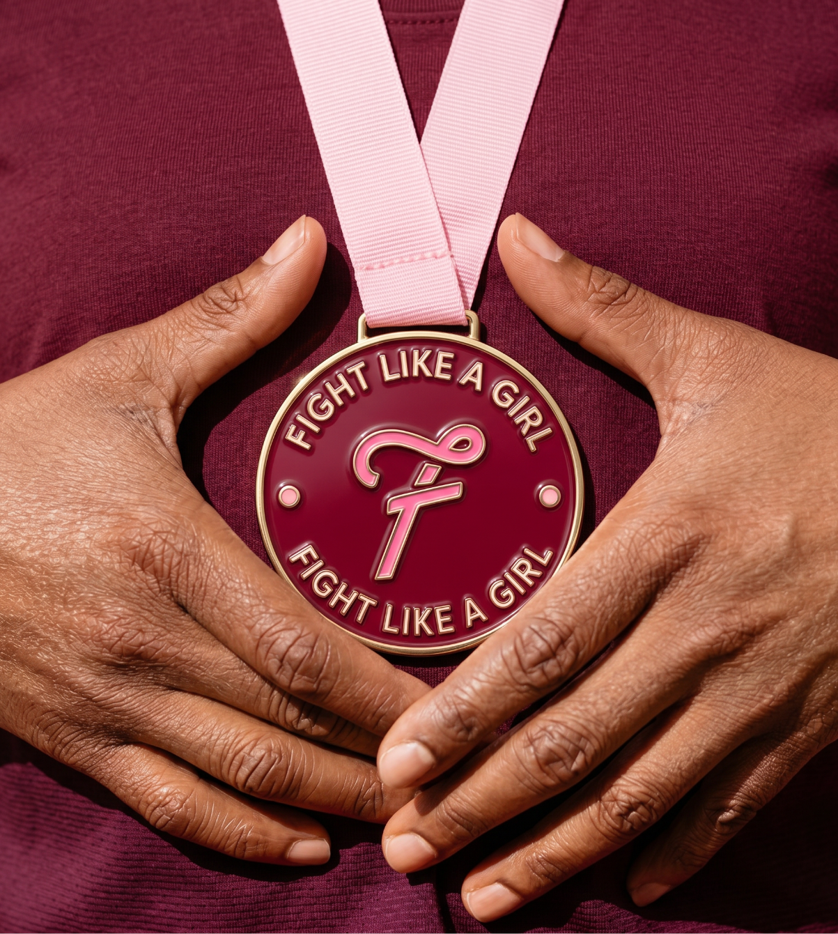
A Bulletproof Visual System: Instead of providing a single static logo, we delivered a comprehensive, multi-color branding pack with scalable asset lockups, merchandise templates, and presentation decks. This gave their internal team the tools to scale the community seamlessly.
Commercial Authority for Funding: We cleaned up their presentation files and visual pitches, providing a polished, high-end corporate presentation system that commands respect in boardrooms.
The Resonance
Aesthetics are a commodity, but clarity drives real backing.
Within just 4 months of rolling out the new identity, the shift in commercial confidence was undeniable:
Financial Velocity: The team successfully secured over £25,000 in immediate funding, unlocking rapid operational scale.
Operational Confidence: The founders felt completely empowered entering high-level rooms to ask for financial support, knowing their visual footprint fully matched their internal ambition.
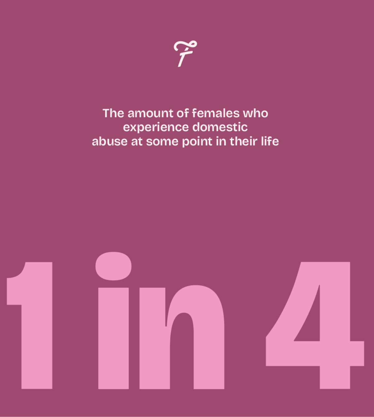
Community Traction: Gym session uptake among young girls has surged, creating a strong foundation for the brand to expand from its North East roots to a nationwide scale.
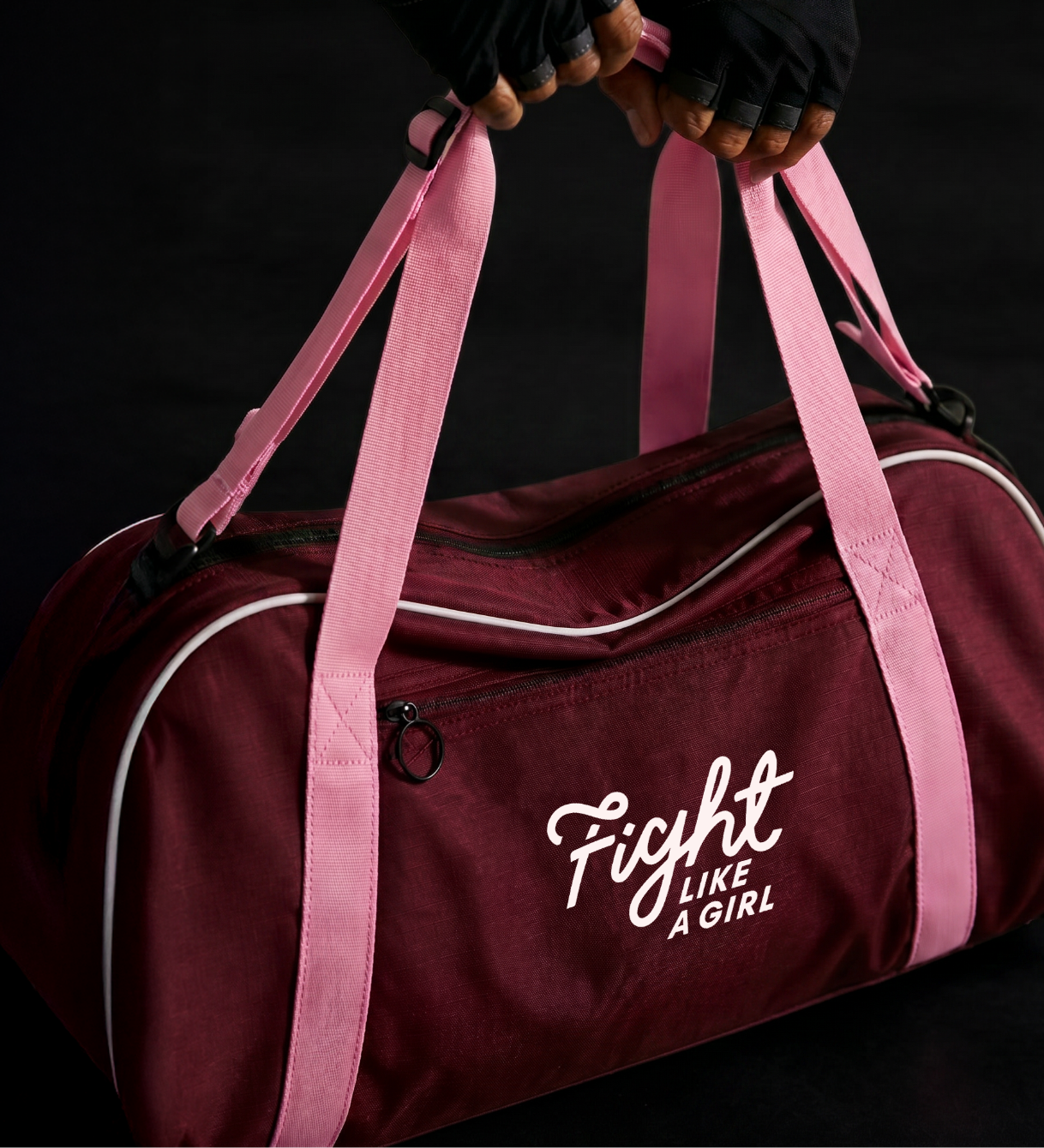
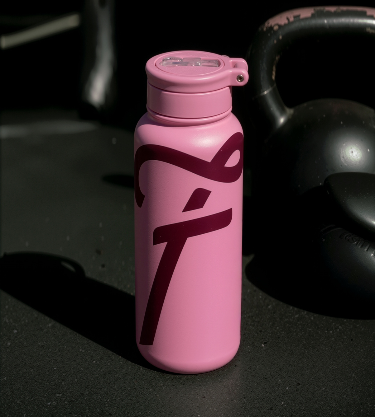
It was even better than I ever could have imagined. Trumpet took the original “brain dump” and transformed it into the most amazing brand that we are OBSESSED with!
I initially was expecting one logo and a colour scheme and font, but we received a full branding pack with various logos/colour ways/graphics, and Mel is always on hand to make sure we stay on brand. The team went well above and beyond what I would have expected based on the brief.
— Eve Lister Co-Founder
Does your brand need the best fighting chance?
Be honest. If your visual identity looks cheaper or more chaotic than the actual quality of your product, you’re losing sales to better-packaged stories. If you’ve outgrown your early-stage logo, you are carrying design debt that’s holding you back. Let’s fix it.