Why does everything in my category look the same, and why does that cost me?
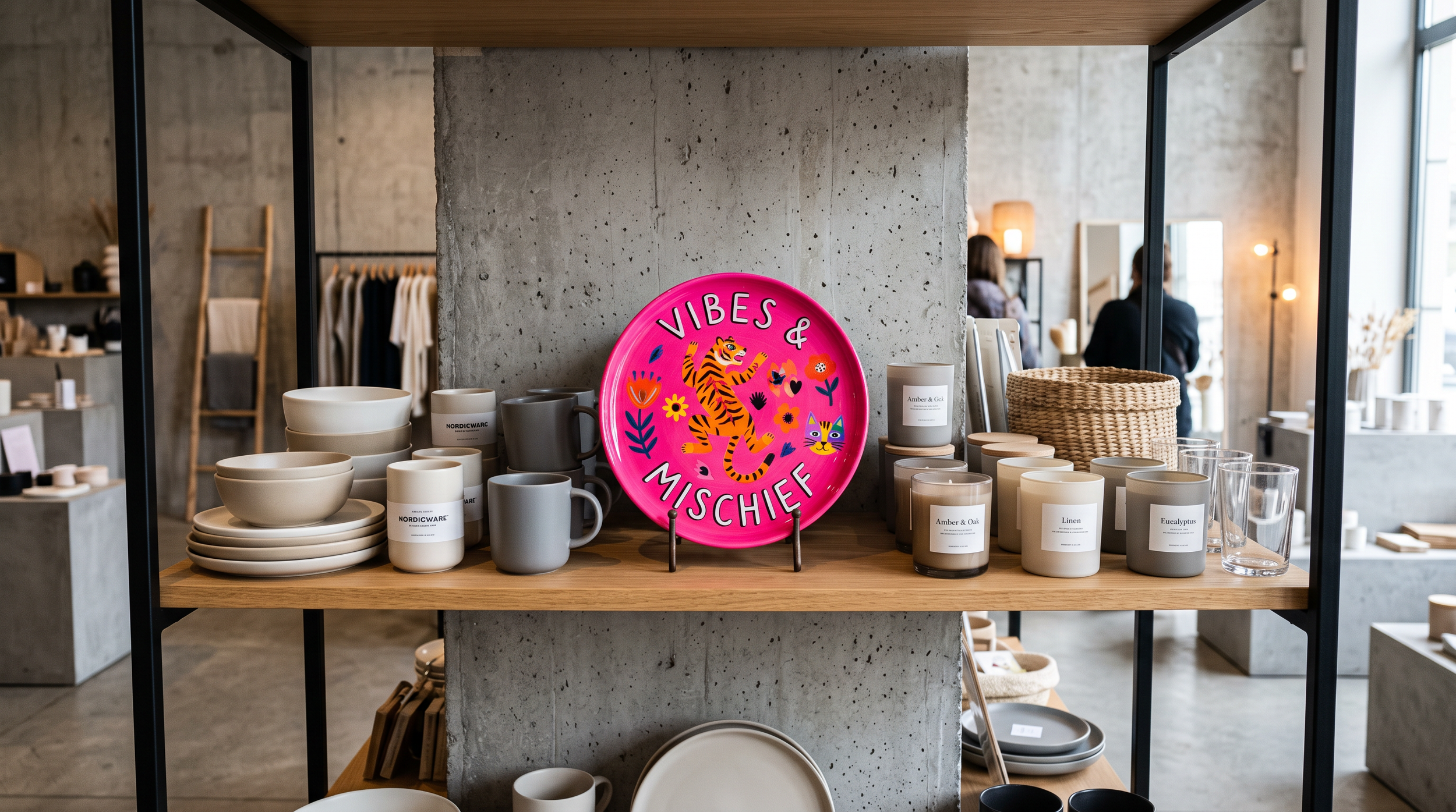
Scroll your category for two minutes. Same three fonts. Same soft, tasteful palette. Same clean-and-minimal look that reads as "nice" and nothing much else. Line the shelf up and you could swap the labels around and half the customers wouldn't notice.
You've felt it. That flicker of "we all look like each other" when your product sits next to five others and disappears into them.
Here's the thing worth saying first: you didn't do anything wrong.
Sameness isn't a personal failing; it's a gravity the whole category is pulled by. It's worth understanding why, because the cost of it is real.
Why it happens
Safe feels sensible. When you're building a brand while also making the product, running the accounts, and packing the orders, "looks like a proper brand in this category" is a reassuring target to hit. So everyone copies the category leader, or the template, or the look that's clearly working for someone else.
The trouble is that everyone is doing exactly that. Aim to look like a credible member of the category and you succeed at looking like every other member of the category.
What it costs you
Sameness is expensive in a quiet way, which is why it's easy to ignore.
It costs you attention.
If nothing about you catches, people scroll past, and you pay more to be noticed at all.
It costs you memory.
Look like everyone else and customers can't hold you in their head, so they don't come looking for you by name.
And it costs you price.
When you're interchangeable, the only lever left is being cheaper. Distinctiveness is what lets you charge more for a product that sits on the same shelf as the rest.
That last one is the real bill. Blending in doesn't just make you invisible, it caps what you're allowed to charge.
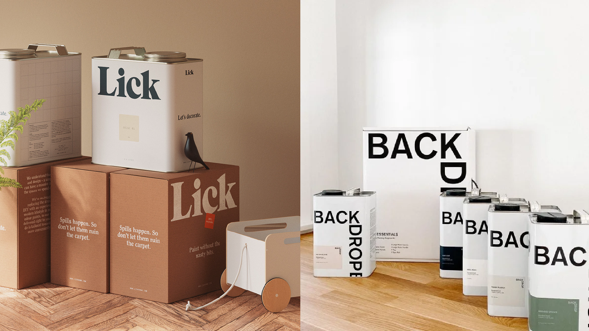
The fix isn't just "be different"
Here's where a lot of founders take a wrong turn. They hear "stand out" and reach for loud, or weird, or different for the sake of it. That's just sameness with the volume up.
The version that works is considered, not off-the-shelf.
Distinctive because it's rooted in something true about you: who you're actually for, what you actually stand for, the thing you do that the others don't. Difference that's earned holds up. Difference that's decoration wears off.
So the question isn't "how do I look different." It's "what's true about us that no one else can copy," and then having the nerve to build the brand around that.
If you want to see how distinctive your brand reads right now, book a brand call and let’s get under the skin of how to make you resonate
-
Because most are built to look like a credible member of the category, and the safest way to do that is to borrow from whatever's already working. Multiply that across a whole sector and you get a shelf full of brands that all reached for the same fonts, colours, and clean minimal look. It's not laziness, it's the pull of playing it safe.
-
Yes, but on purpose, not for the sake of it. The goal is to be distinctive in a way that's rooted in something true about you, so it's recognisable and hard to copy. Different-because-it's-loud fades fast. Different-because-it's-you is what earns attention and holds a higher price.
-
The bigger risk is blending in. Standing out feels exposed, but it's what makes you findable, memorable, and worth more than the cheapest option on the shelf. The trick is to stand out from who you genuinely are, so the distinctiveness is a fair signal of what you're like to buy from, not a costume.