How a 130-Year-Old Watering Can Became a Need-to-Have
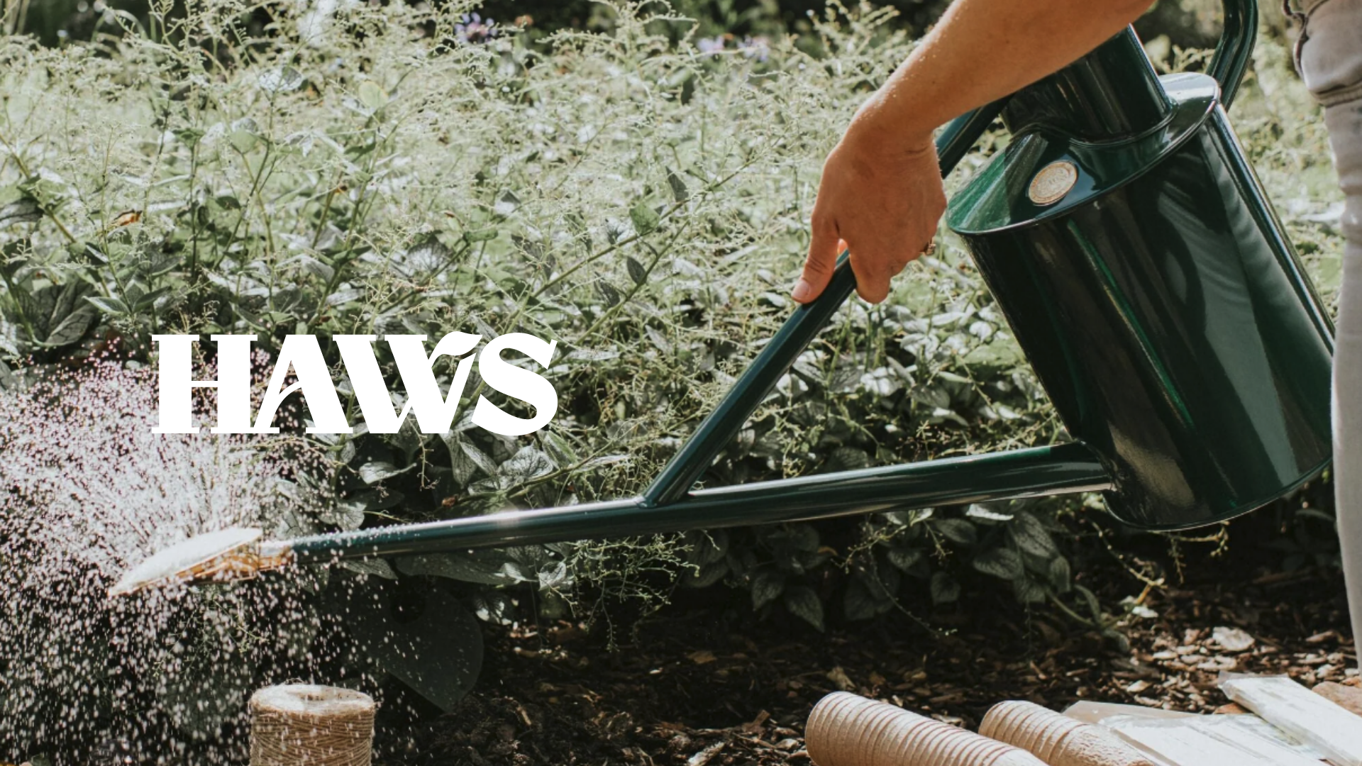
Now hear us out. Days of old show 'the gardener' as a doddering old boy, whiling away his days in his sanctuary. But cultural shifts show younger people (well, millennials mostly — we're still young, right?!) taking up the hobby, pulled in by personal wellbeing and viral aesthetic trends. I was even hooked on Instagram watching this guy transform his garden.
So why does it feel like brands are missing the moment? Some are onto it. Most aren't. We're talking about transforming the dull into the beautiful. Grass seed, spades, plants, furniture, bird feeders. Oh, and this one that's stuck with us for a long time...Haws.
Now, this isn't a new kid on the block, nor is it a fresh rebrand.
Why we want to talk about it is because, to us, they made watering cans super sexy. Yeah. There you go. We said it.
And that was exactly the point of the whole thing. They wanted (well, needed) to appeal to a younger market without losing the credibility of their heritage.
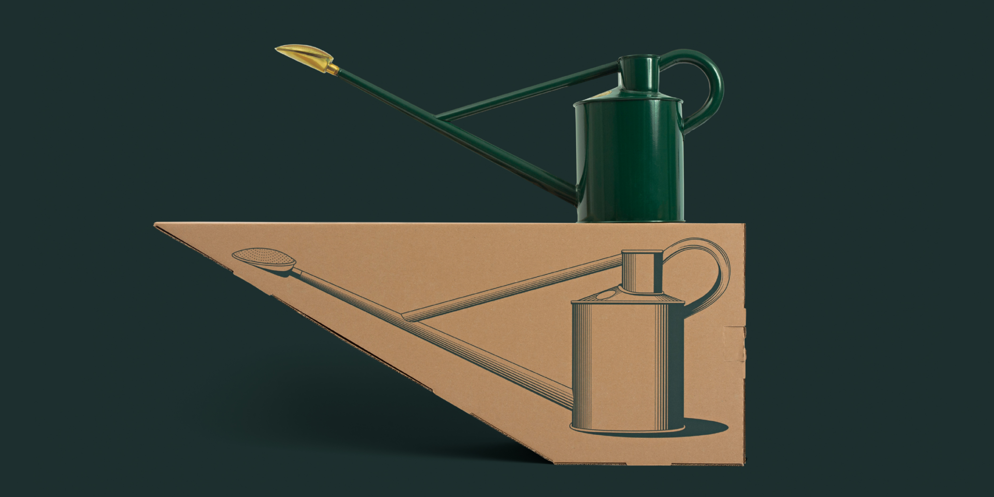
The clever part? They barely touched the product.
A Haws watering can is more or less the same handmade design it's been since 1886. A signature long spout, beautifully balanced and built to last a lifetime. They didn't need to reinvent the can. They needed to reinvent how it makes you feel about owning it.
Somewhere along the way, their cans had quietly stopped living in the shed and started living on the shelf. Now they are perched next to the monstera, starring in reels, treated like an object you display rather than a tool you hide.
Haws found their products had become a bit of a design lover's trophy. They knew a rebrand was needed to catch up to a story their customers had already started telling.
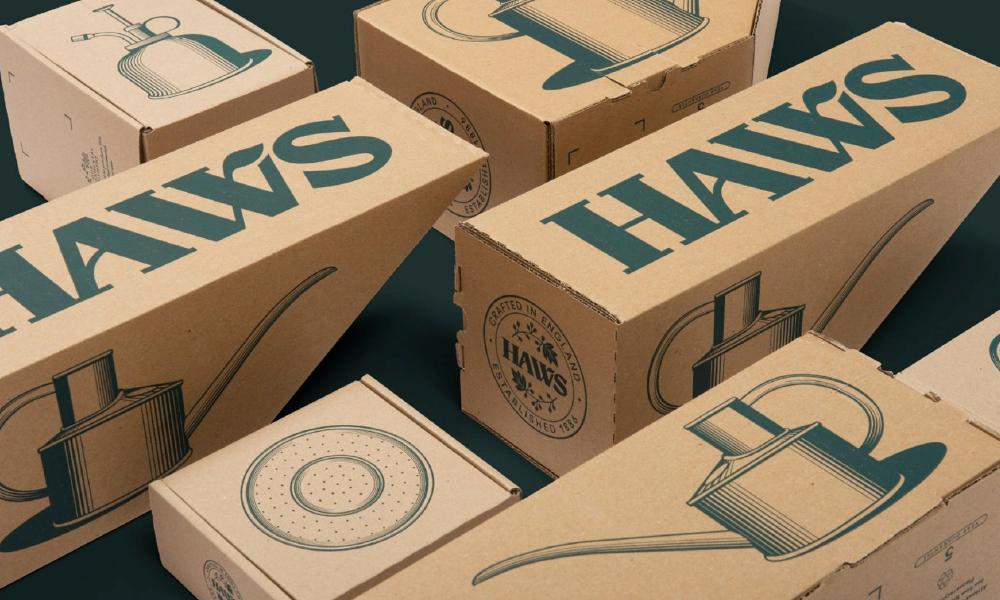
So they leaned in, working with London studio Together Design, who led the strategy and rebrand. They delivered a visual identity that feels premium without feeling precious. Packaging that's honest and truly lovely, as well as carefully considered details like the box echoing the shape of the can inside, the logo front and centre in that gorgeous sea green.
It’s heritage repositioned as desirable rather than dusty.
Understandably, it went on to win Dieline's Rebrand of the Year in 2020, and you can see why. The result? A humble watering can that people genuinely want, are happy to pay more for, and will proudly leave on show.
The shift they spotted (which most home and lifestyle brands don’t)
Here's what's really going on underneath. The stereotype has flipped.
Gardening isn't a quiet retirement pastime anymore. It's wellbeing, it's aesthetics, it's plant-parenting (I’m looking at you Clare). And the generation driving it don’t want more stuff. They want fewer, better and more beautiful things.
What founders might miss is that there are people out there right now, ready and willing to spend a little more for something high-quality and aspirational to live in their home. They already want to. The only question is whether a brand gives them a reason to choose it over the near-identical thing sitting next to it on the shelf.
Haws gave them that reason. Most garden branding (and plenty of homeware branding too) still doesn't.
So here's the uncomfortable-in-a-good-way part
If you're a founder making genuinely lovely things for gardens and homes, the Haws lesson is a gentle nudge in the right direction.
Your product might already be good enough to command more. Your brand just hasn't caught up to it yet.
You've built something people love, it just doesn't always appear or communicate how good it actually is. And that gap between how good you are and how good you should be? That's where the opportunity gets lost.

Which is our whole thing
We lead brand strategy, identity and packaging design projects for founder-led home, lifestyle and garden brands. We help you look as premium as you already are, so the right customers pick you, fall in love with your brand and happily pay for it. We're based in Manchester and the North West, and we work with founders right across the UK.
If "packaging design Manchester" is the phrase that brought you here, hello and yes, that's exactly the kind of work we love getting our hands dirty with. (Pun very much intended.)
Coming up: we'll actually show you
Talk is cheap, so next time we're going to put our money where our mouth is.
We'll take a real garden brand and walk through exactly how we'd rebrand it. The thinking, the exploration, the whole shebang. So you can see how we work in practice rather than just taking our word for it.
Don't want to miss it? Subscribe to Fanfare, and we'll drop it straight in your inbox.