How we stopped Ditto Fragrances looking like a copycat
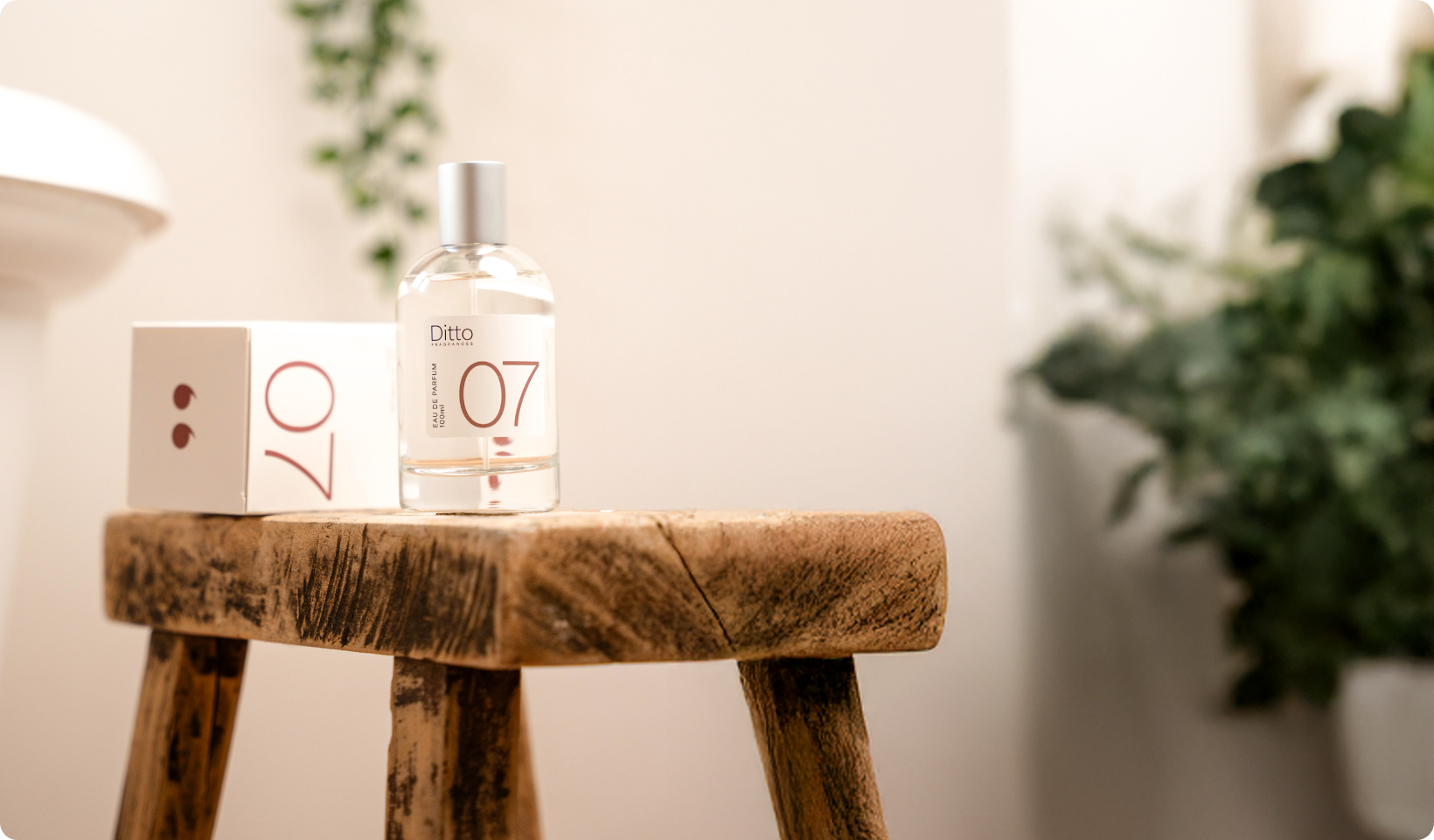
The brand problem
Ditto came to us with two clear problems: ‘our pack design needs a facelift’ and ‘we need to attract more customers' - not uncommon problems to bring to the table.
The main crux of these two problems, however, was that the brand needed a refresh and especially needed clarity. So how did we do this…
Brand audit and competitor analysis
It’s no news to anyone that the dupe fragrance market is a heavily saturated one. Full of copycats in more ways than one. Two of Ditto’s main competitors look so alike I can’t really remember which one is which.
Now don’t get me wrong, there’s a market for these kinds of products; hell, I myself have bought from the likes of Noted Aromas and The Scent Reserve. Offering bundle discounts of 3x100ml of the nation’s most loved scents.
So when it came to helping redefine Ditto and their brand position, we needed to know just how samey the market was. And where Ditto sat amongst the noise.
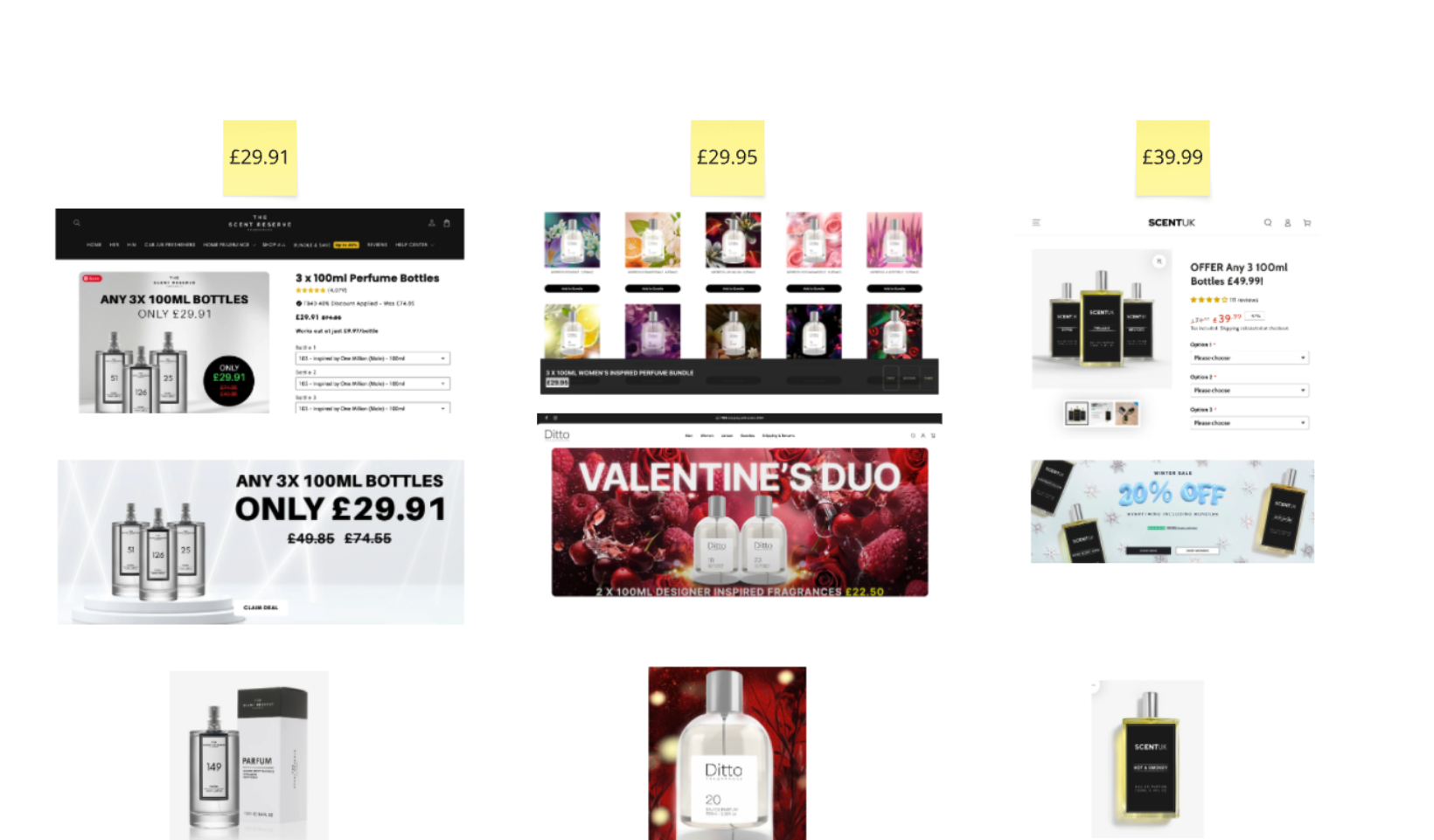
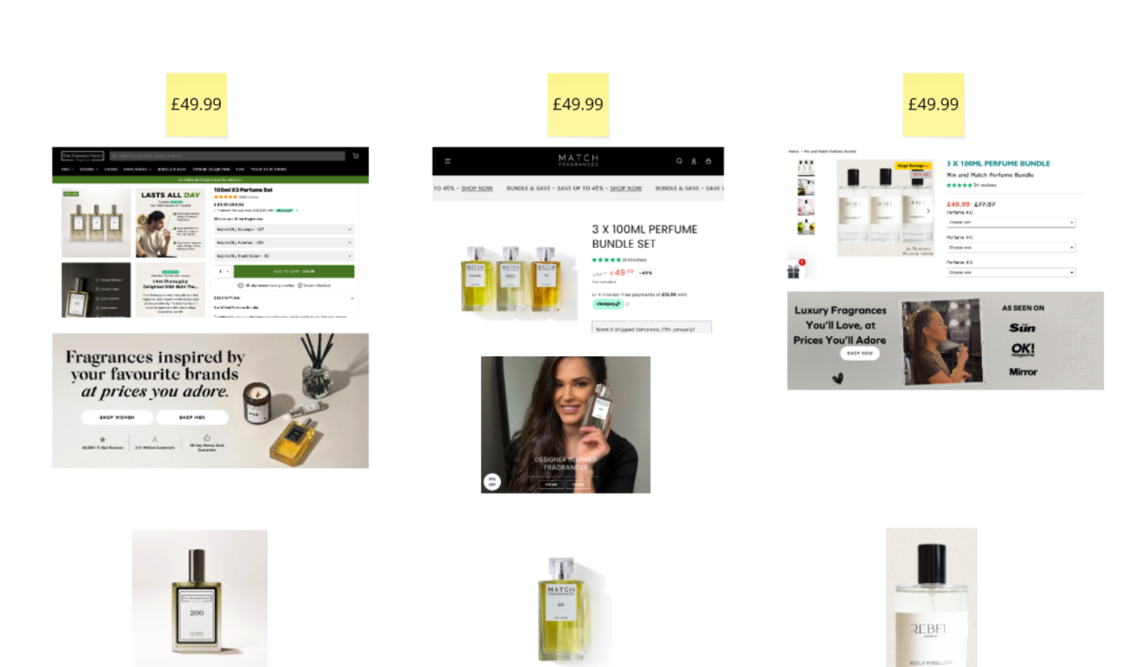
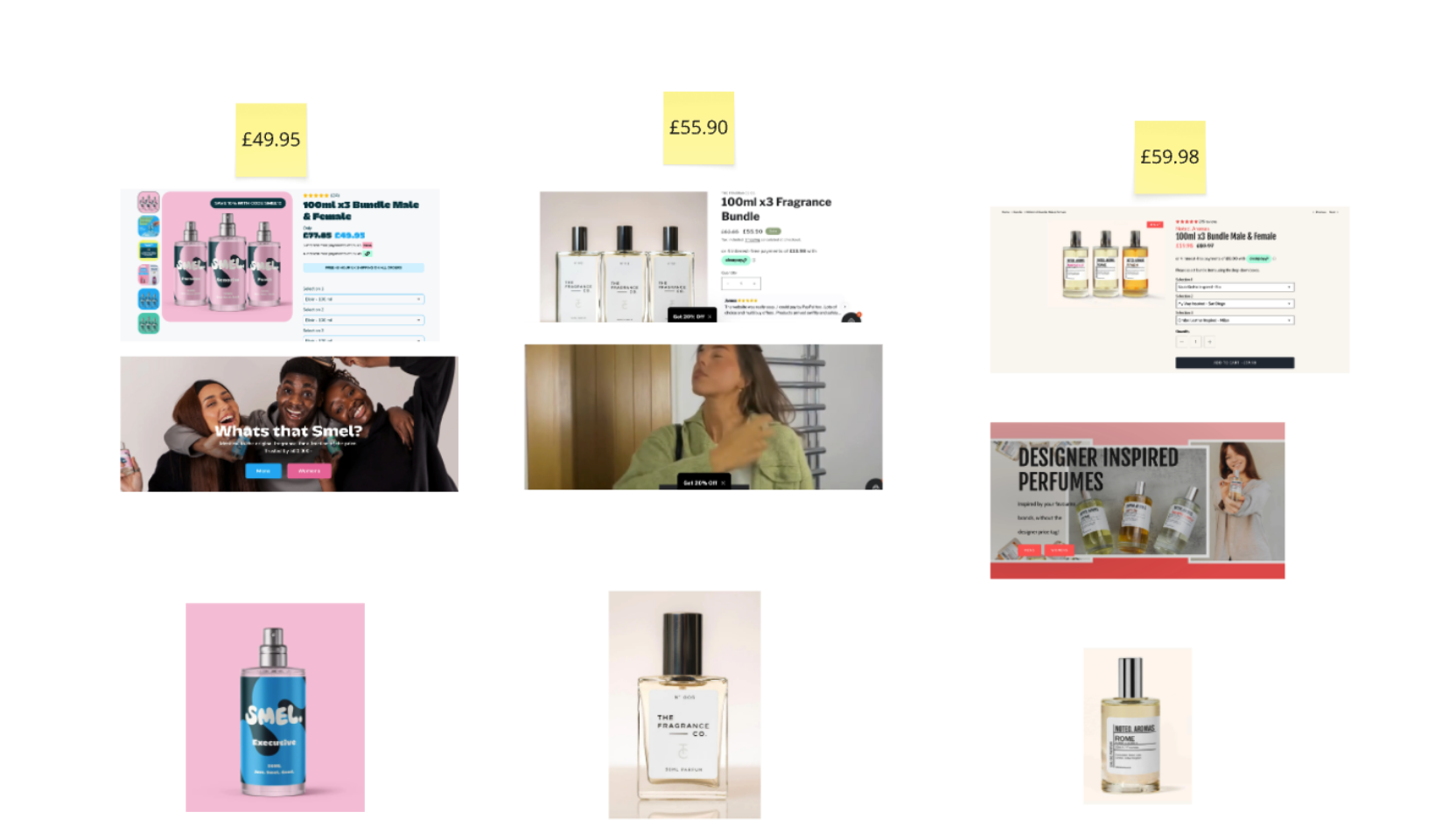
Once we analysed the market, it was exactly as we suspected: a whole lot of offers, no real distinction, and an awful lot of noise.
We audited the landscape based on Ditto’s price point at the time of 3x100ml for £29.95. Why did we do this? Well, someone who is looking to spend £30 on dupe fragrances is expecting, let’s say, a ‘limited’ amount of finesse in comparison to someone spending £60 upwards.
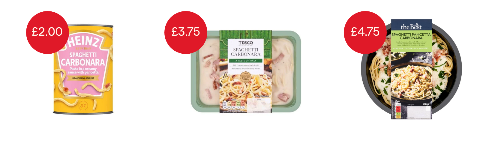
We liken it to the supermarket aisle.
When you choose a budget product, you expect it to look budget; if you’re looking to spend a little more, you want it to feel like you’re getting more quality. And if you’re pushing the boat out, you want a bit more decadence.
So with Ditto, we needed to know ‘Where do you want to be?’
One route kept Ditto where they were – as a cost-effective Dupe Fragrance Brand. In which case they simply needed to tighten up the brand so it was clearer in what it did differently.
And the second route aligned the product to a higher price point (x3 100ml for £50) and would deliver Ditto as a higher quality dupe brand.
The reason we asked this was that the brand so far had several what felt like style-led brand refreshes, and the pack design they came to us with was a result of the same thinking.
Exploring both routes
To make sure we were making the right choice, we explored both routes.
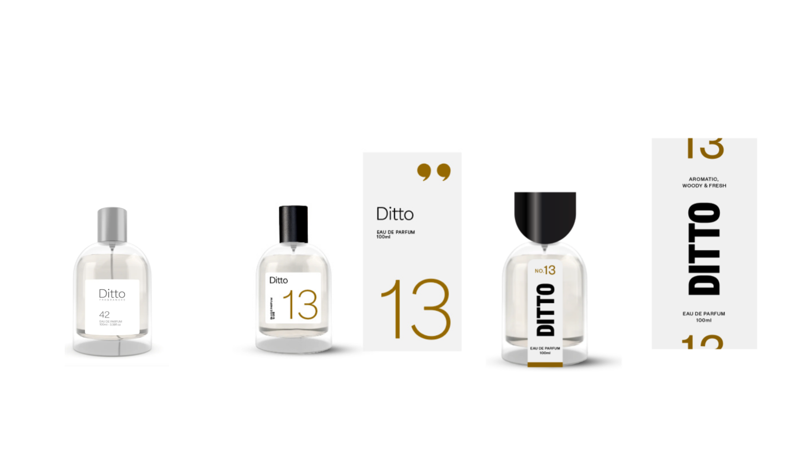
One route with more clarity and resonance. Route two with a more distinctive and higher quality look and feel.
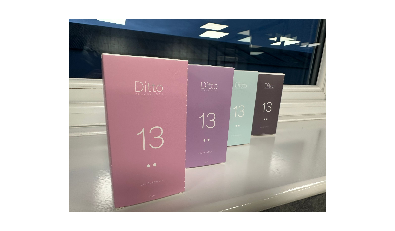
We needed to keep the numbered system for fragrance referencing. But one key thing in each route we wanted to deliver was a key brand differentiator on the pack.
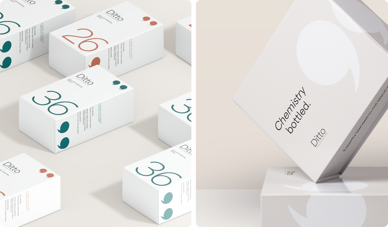
The first route leaned into the numbered system; instead of hiding it, we blew it up to be the clear indicator (perfect for users who need to know their ombre leather from their creed). We also added a subtle speech mark graphic to nod to the Ditto name.
The second route purposefully aimed to push them further, suggesting a lid shape which mimicked the bottle shoulder shape. We also opted for a punchier, premium type treatment.
The team opted for route one and decided to stick to their guns and offer a more affordable price point.
Delivering a brand
Ditto from day one, never seemed to truly have a brand. It looked like it did from the outside, but reality showed no real reason to buy. No brand differentiator. No loyal fan base.
We set out to change that. Now we spent a lot of time with Ditto and in their offices and we knew they made and crafted their fragrances in-house, fine-tuning oil ratios and dialling in scent longevity to a high standard
Surely this was a cause to amplify. The name Ditto itself already held a lot of brand connotations. It already nodded to the Dupe world, and in that thinking we arrived at the brand idea. Something to hang the Ditto hat on.
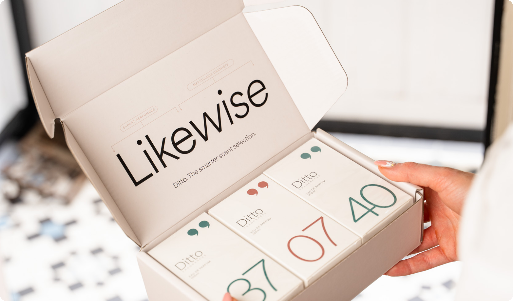
‘Likewise’ was this idea. One which combines the scents you love to wear with the meticulous chemists which bring them to you. The smarter scent selection backs this up from a spending POV as well as the thought and consideration that goes into creating the products.
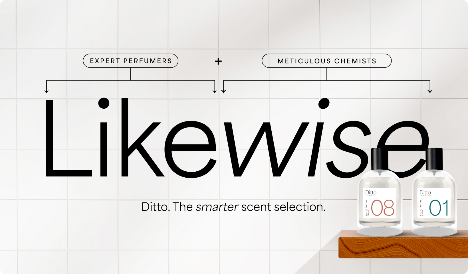
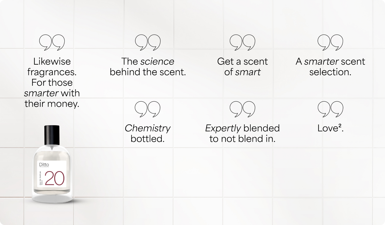
One thread we aimed to retain through the concept was one of duality. Even messaging we wrote had a one-two approach. This also came through the scent description cards. One side focused on the scent and feeling, the other on the breakdown.
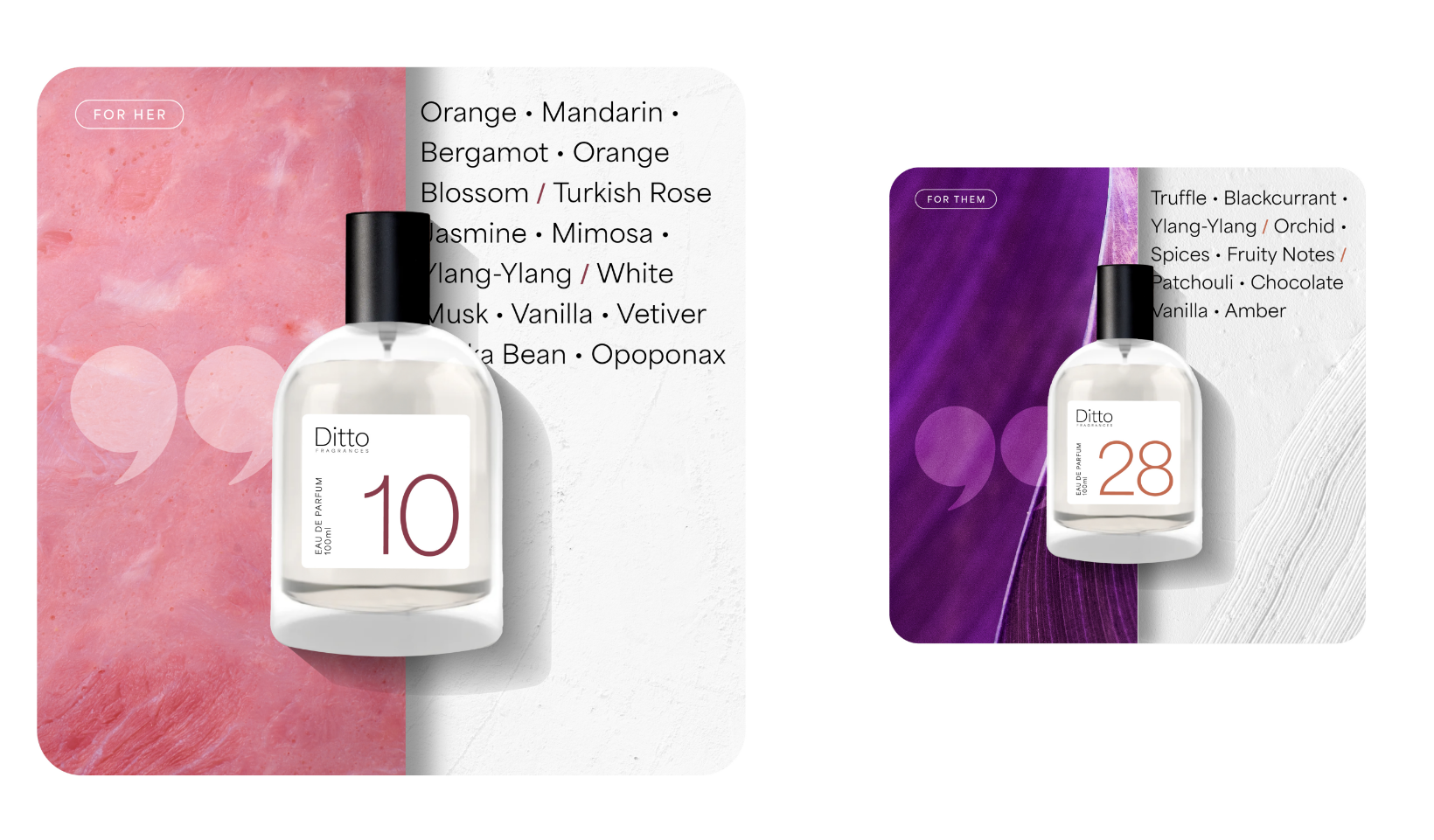

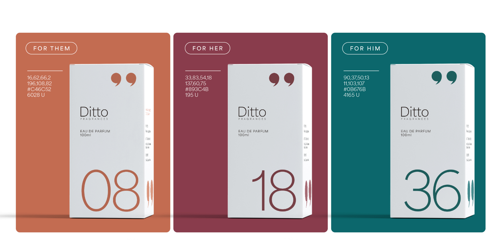
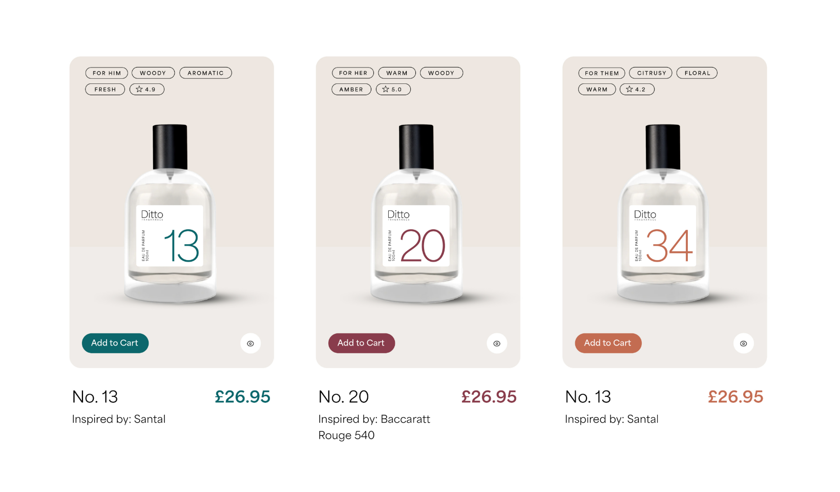
Colourwise, we wanted to simplify the brand choices. Removing decision fatigue for future products, we opted for three colours. Simply, for her, for him and for them.
Bringing it to life
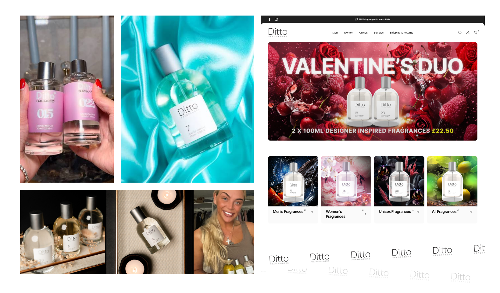
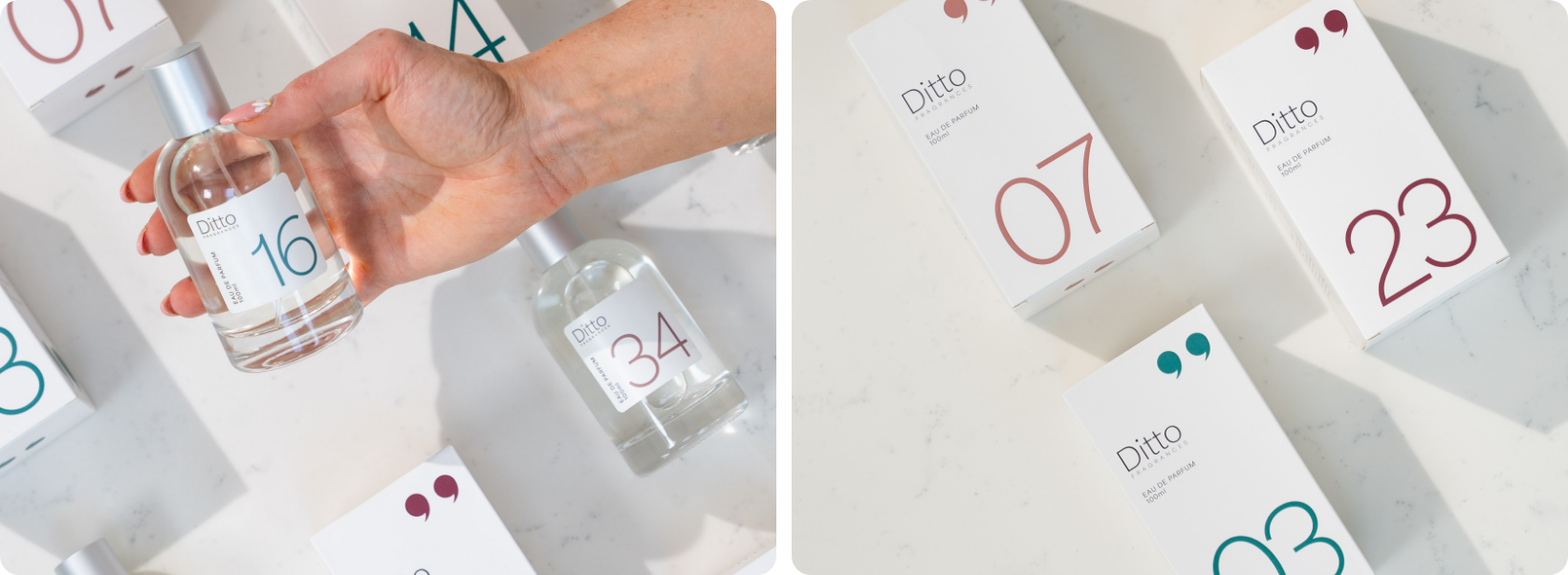
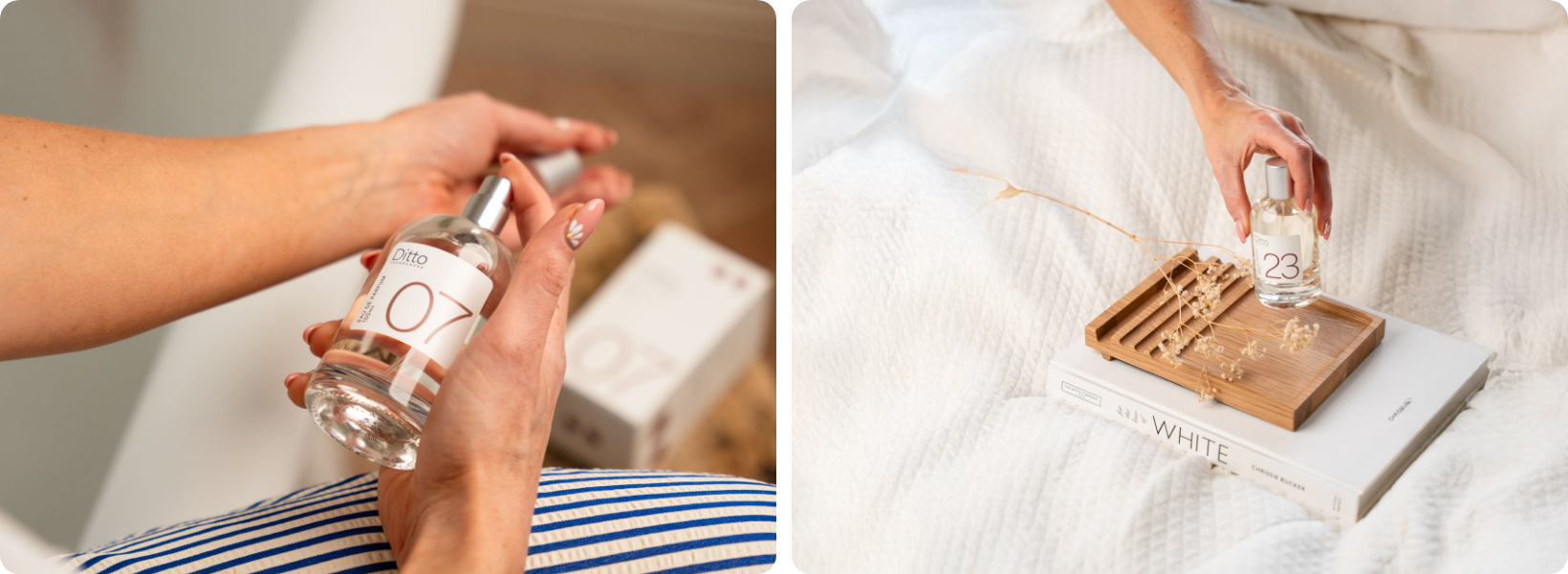
Once we had a defined brand identity system, we set out to art-direct the lifestyle photography. A lot of the dupe fragrance brands live in the mocked-up artwork world. We wanted to add more credibility to Ditto by showing the unboxing process and the packaging in real-world scenarios.
This session was captured with Harry at Capture Creative in a half-day shoot to keep budgets on track.
Beyond the brand
As part of the brand rollout we also helped to re-skin the existing Ditto website with the new brand, updating all their old imagery with the new assets within Shopify.
We also worked closely with their team to update the content and adjust the navigation to help better steer customers to particular products.
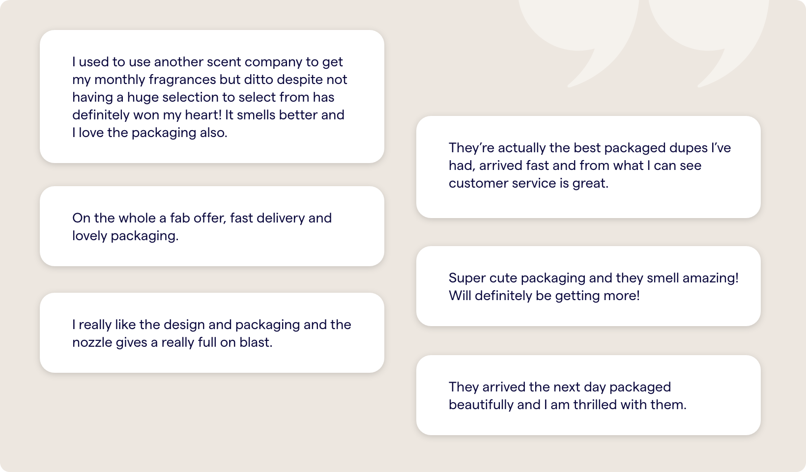
Overall, the new look and feel was well received with clients new and old.
Sound familiar? Swap 'fragrance' for candles, homeware, or skincare and the problem's the same, a saturated market where everyone's product looks, sounds, and feels identical. Ditto just happened to be in scent. The thinking behind fixing it applies wherever founders are fighting to look like themselves.